Rise of the Dark Mode
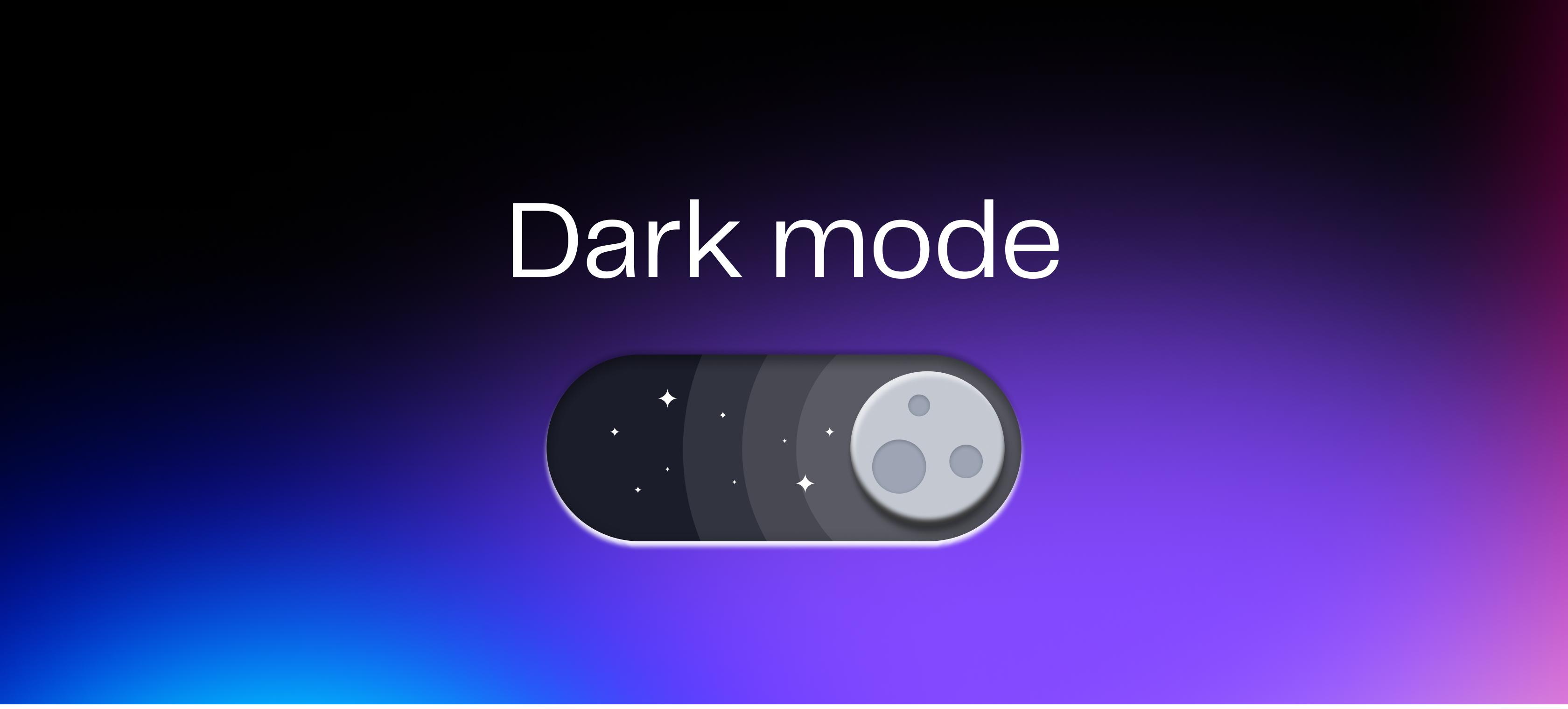
What is Dark mode?
Dark mode, often called "Night mode" or "Dark theme," is a visual style of digital interfaces that uses darker colours to replace bright coloured backgrounds. It’s a popular design trend as it gives users the choice to change the appearance of their favourite app or website, leading to a number of benefits. It's not just about appearance; dark mode may make it easier on your eyes, especially when you're staring at screens in low-light conditions for extended periods of time. When Apple released Dark mode they described it as a "dramatic new look that's easy on your eyes and helps you focus on your work."
Benefits
There are potential health benefits to using dark mode. According to this study, exposure to blue light has demonstrated side effects such as difficulty sleeping and eye strain. Switching to dark mode while browsing before bed may help maintain a healthy sleep-wake cycle and improve sleep quality according to Antonio the Optometrist. In dark settings, such as a cinema or bedroom at night, it can be less of a disturbance to other people in the room as the device will not emit as much light. Dark mode can also save battery life and lower visual noise. On devices with OLED screen technology, black pixels do not turn on at all, giving images a realistic appearance and reducing battery usage.
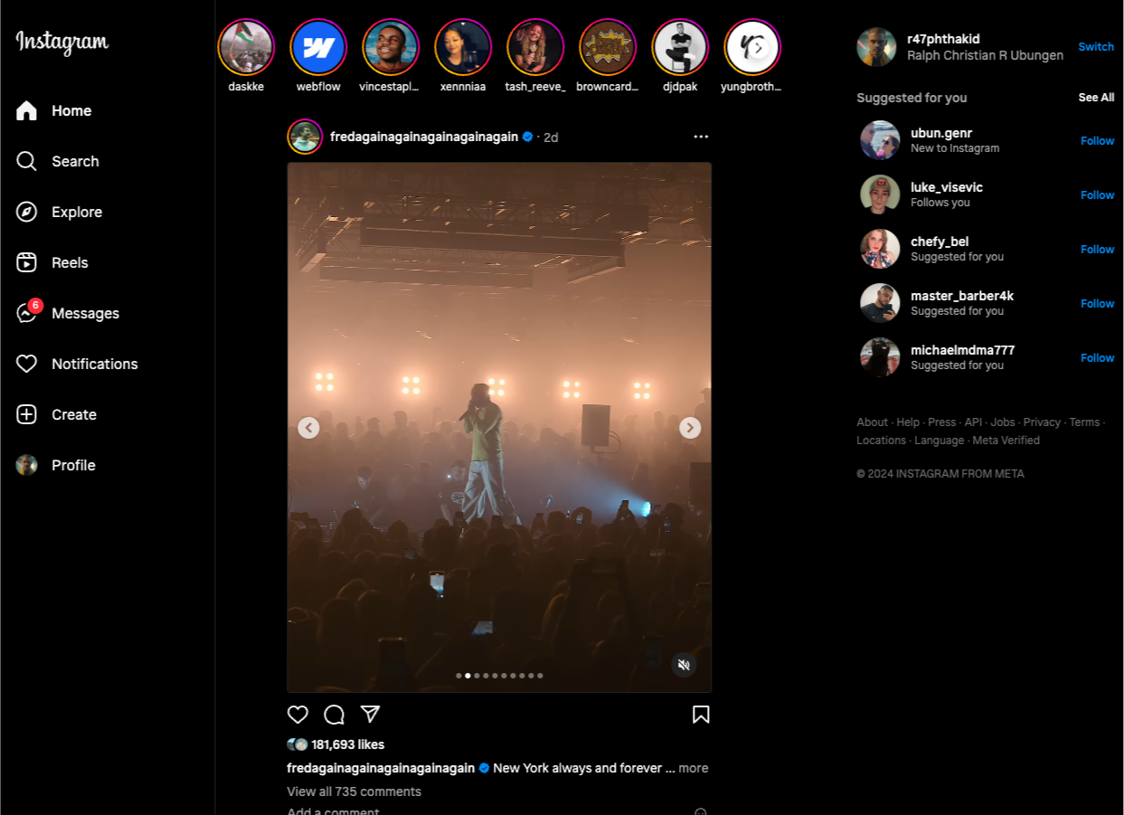
- Instagram in dark mode
However, the impact of dark mode on health may vary from person to person based on factors like vision and eye conditions such as cataracts. While some individuals find it beneficial, older individuals may prefer light mode due to reduced pupil size. A NNG article states that one-third of mobile users use dark mode, one-third use light mode and one-third use a combination of both. To cater to different needs, offering dark mode as an optional preference is preferrable.
How we apply Dark mode
Applying dark mode in web design isn’t as simple as inverting colours. Designers often use drop shadows on light mode to create depth and separation. Drop shadows however aren’t visible in dark mode, just as shadows aren’t visible at night. To solve this, designers use visual elevation which uses lighter colours on foreground elements and darker colours for backgrounds to make them stand out and separate from each other.

- Visual elevation in dark mode replaces box shadows in light mode to create separation.
A primary colour on light mode may pass WCAG’s colour contrast guidelines but may not be the case in dark mode. Adjusting primary colours such as adding more brightness and/or desaturating the colour helps to maintain enough contrast for users with poor vision in dark mode.
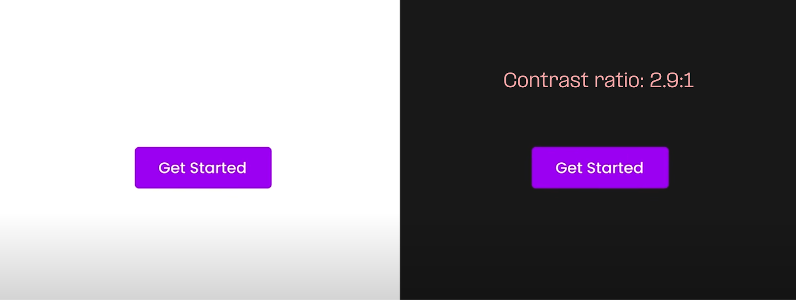
- Using the same colour for both themes in this example doesn't pass the minimum contrast ratio in dark mode.
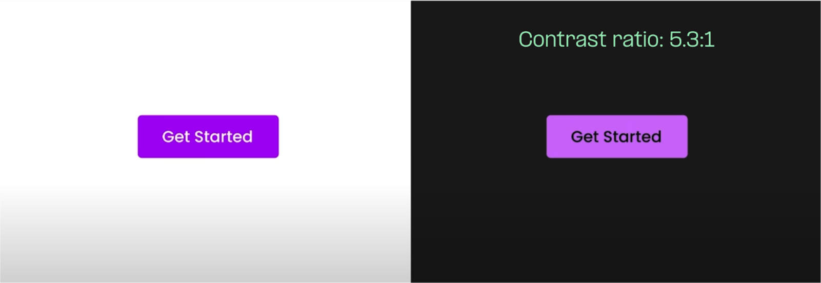
- Increasing the lightness and/or desaturating the colours to pass contrast ratio
Once we establish the colours for dark mode, we give each colour a specific job and use design tokens to apply them to both dark and light modes. For instance, we might assign the colour black for icons in light mode and white for icons in dark mode.
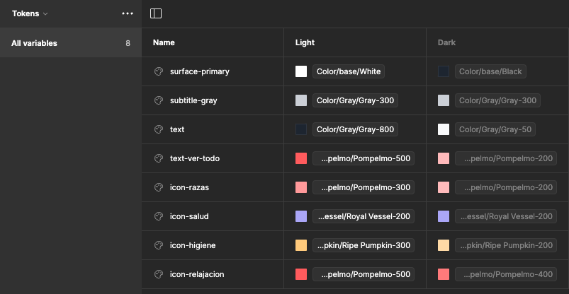
- Example of assigning colours to a specific job
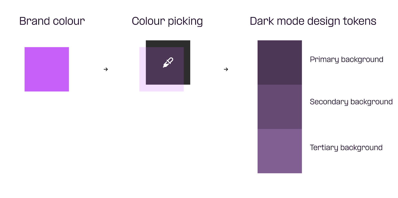
The role of Dark mode in design systems at Digital Garden
At Digital Garden, integrating a dark mode colour palette into the design system significantly simplifies our process. By blending shades of grey with a hint of the client’s brand colour as design tokens, we accelerate our design process, eliminating the need for separate dark mode pages and ensuring consistency. This approach lets our designers concentrate on refining layout and colour contrast, leading to more polished and cohesive designs. Plus, it's flexible for clients which we design and build their own design system, enabling seamless integration into future products or features that may require dark mode.
Conclusion
The rise of dark mode signifies more than just a design trend; it's a blend of aesthetics, user comfort, and potential health benefits. As designers, incorporating dark mode as an optional preference aligns with the diverse needs of users, contributing to a more inclusive and enjoyable digital experience. Whether for work or leisure, dark mode continues to redefine how we interact with interfaces, offering a visually pleasing and health-conscious alternative.
“Once you start down the dark path, forever will it dominate your destiny” - Yoda, Star Wars