Visual redesign and IA overhaul of a GovCMS website

Visual redesign and IA overhaul of a GovCMS website

client-logo

Visual redesign and information architecture overhaul of a GovCMS website

project-slider
project-slider

Design brief

AUSTRAC is the Australian Government agency charged with protecting the our nation’s financial system and the community it serves from organised crime, money laundering and terrorism financing.

The website (built on GovCMS) had been underperforming due to a convoluted information architecture (IA) and an outdated design and navigational devices.

project-mosaic-item
project-mosaic-item
project-mosaic-item
People power

People power

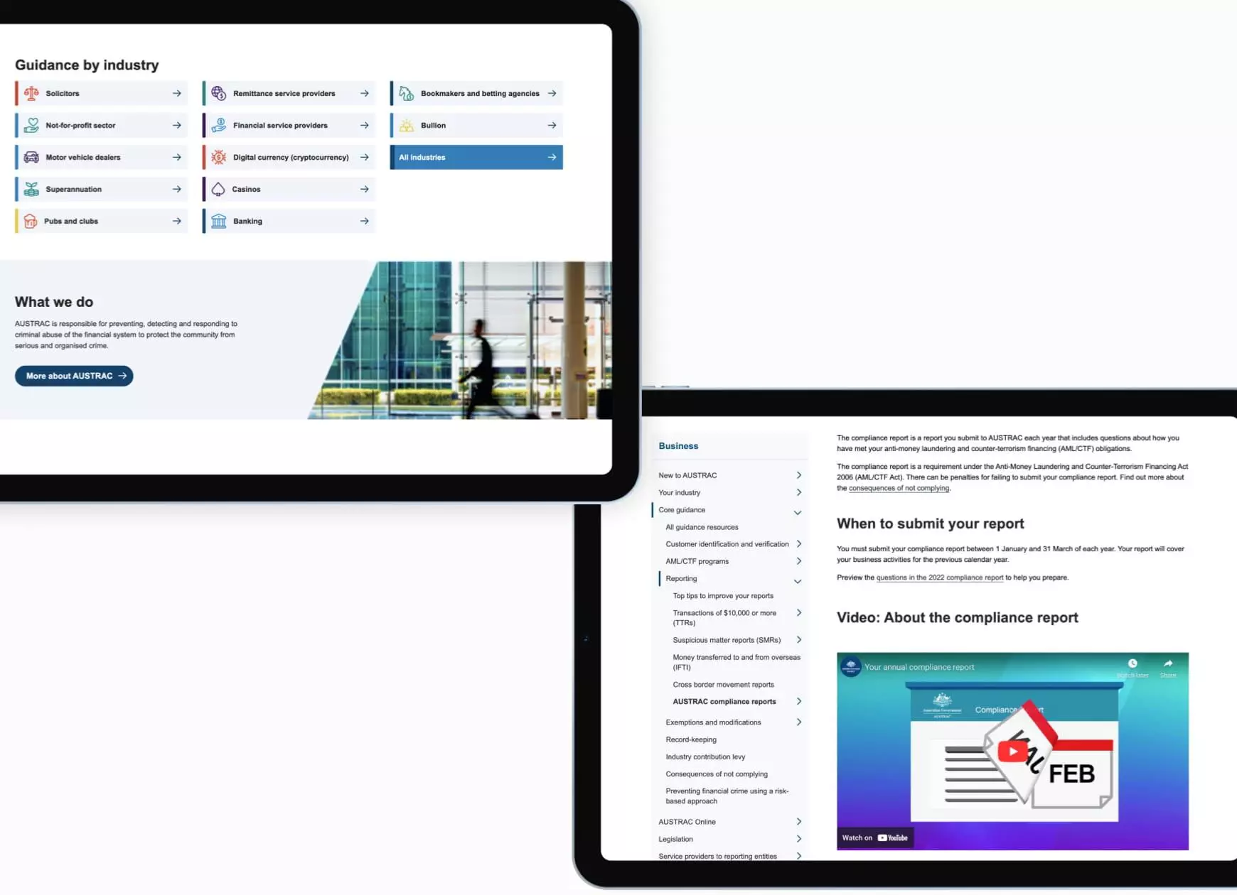
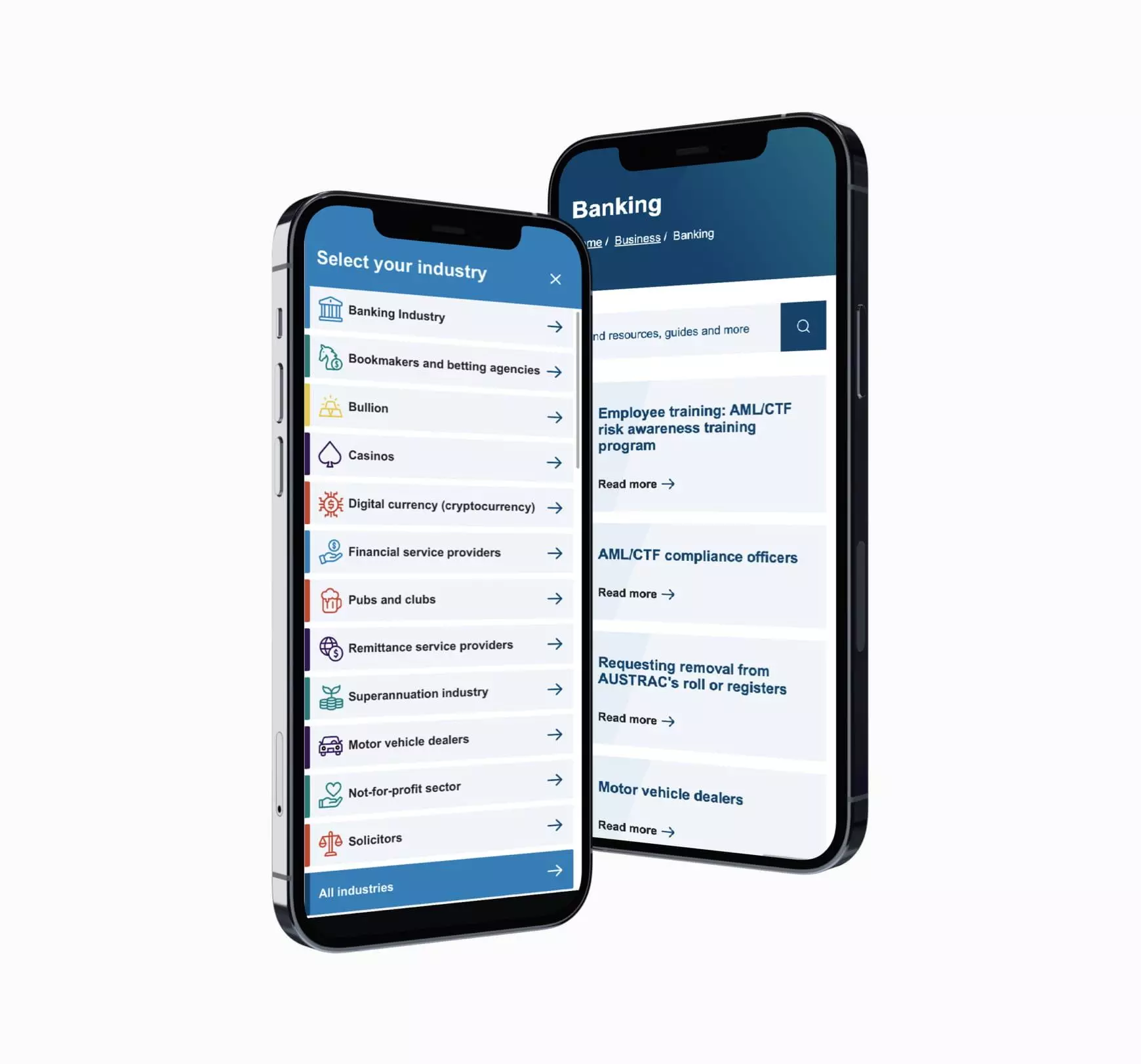
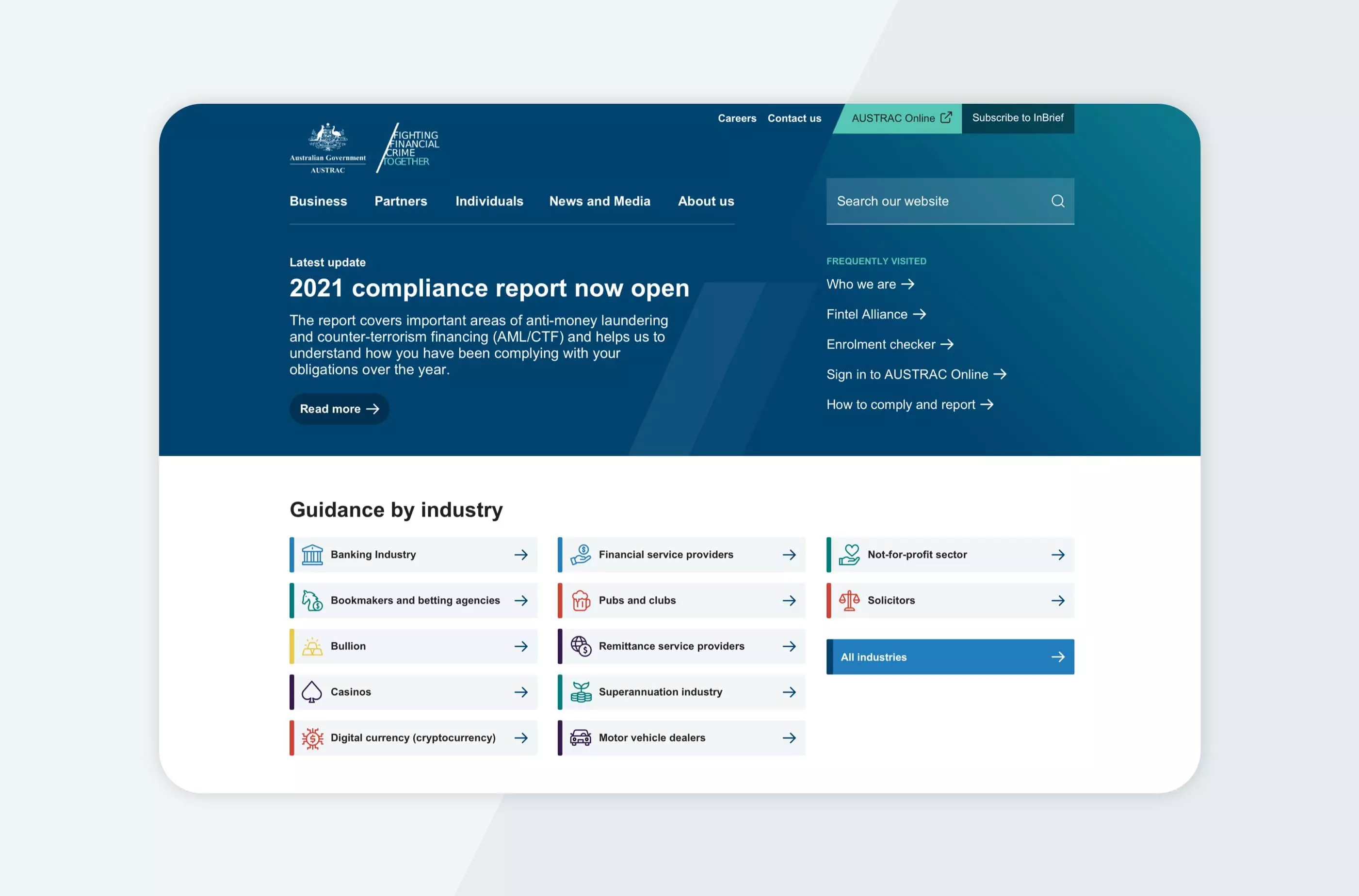
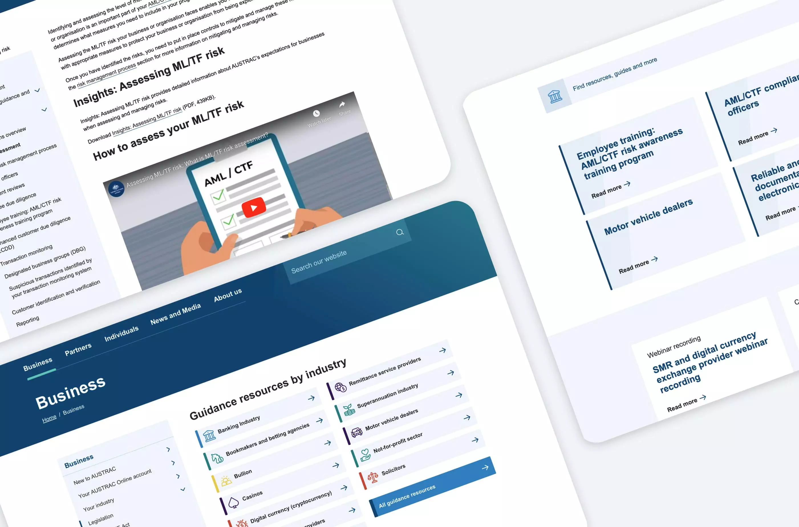
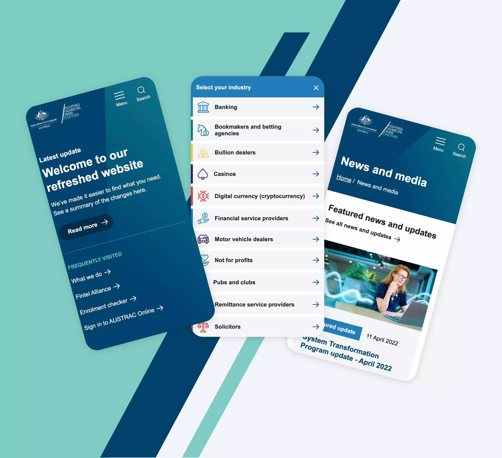
Many of the government agencies Digital Garden works with tend to encounter the same issue: inward-facing jargon and IA that do not reflect how their users in the real world search for information.

To help untangle a complex IA and use language that users are familiar with, Digital Garden ran different user testing activities. 
First, we spoke to a range of users from across various industries and partner agencies of AUSTRAC. This was to understand how they used the existing site and any pain points. We also distributed a tree test of our proposed new IA model to validate and challenge any thinking on how users would navigate through the new site.

Government doesn’t need to be boring

Government doesn’t need to be boring

Digital Garden knows how important accessibility is to an equitable internet. Especially for government websites, the user experience and findability of information needs to be highly accessible.

However, accessible doesn’t need to mean boring. Digital Garden aimed to present an interface that was modern, with some engaging elements and all the while conveying the seriousness of the subject matter.

Talking to your audience(s)

Talking to your audience(s)

AUSTRAC oversees countless businesses across Australia from a myriad of industries. With that spread of audience comes a number of documents which are specific to those certain industries.

We wanted to introduce iconography and colours into the site to denote each audience. The colours and icons follow users through their site journey, helping them to identify at a glance if the information presented is relevant to them.

Results

Digital Garden has designed a modern, stylish website that breaks the standard mould of government websites. The new mega menu standardises how users expect to navigate through the website.

The visual segmentation of audiences through colour and icons helps users get to where they need to quickly be able to digest the information that relates to them.